Generic "Contact Us" buttons plague Las Vegas business websites, stifling conversions. In 2026, successful calls to action (CTAs) must be specific, valuable, and effortless, tailored to the visitor's intent. Personalized CTAs boast a staggering 202% higher conversion rate, while focusing on one primary CTA can amplify results by up to 266%. Discover how to transform your digital marketing strategy and captivate potential customers with compelling CTAs that drive immediate action. Click to learn the secrets that could redefine your customer engagement today!
QUICK ANSWERA call to action (CTA) is the specific prompt on your website that tells visitors what to do next: call you, book an appointment, request a quote, or buy a product. Most Las Vegas business websites rely on generic CTAs like “Contact Us” or “Learn More” that give visitors no compelling reason to act. Effective CTAs in 2026 are specific to the page context, match the visitor’s intent stage, offer clear value, and make the next step feel effortless. Personalized CTAs convert at 202% higher rates than generic ones, and reducing to one primary CTA per page can increase conversions by up to 266%. |
Key Takeaways
- “Contact Us” is the most common CTA on Las Vegas business websites, and it is also one of the weakest. It asks for effort without offering value.
- Personalized CTAs perform 202% better than generic ones. A plumber’s CTA should say “Get Your Free Plumbing Estimate” not “Contact Us.”
- One primary CTA per page outperforms multiple competing CTAs by up to 266%. More options create decision paralysis, not engagement.
- Mobile CTAs behave differently from desktop. Tap-to-call buttons are the highest-converting CTA for local service businesses.
- CTA placement matters as much as copy. Above the fold, after a benefit statement, and at the page bottom are the three highest-converting positions.
- Urgency and specificity drive action. “Book Your Free Consultation This Week” outperforms “Get in Touch” every time.
- Testing one variable at a time (color, copy, placement) is how you find what works for your specific audience.
The “Contact Us” Problem on Las Vegas Business Websites
Visit almost any Las Vegas business website and you will likely see the same button: “Contact Us.” It may appear in the header, the hero section, and again at the bottom of every page.
But that generic button is often the entire conversion strategy.
A call to action, or CTA, is the prompt that tells a website visitor what to do next, such as call, book an appointment, request a quote, or make a purchase.
The CTA is where interest turns into action. It connects someone reading about your business with the next step toward becoming a customer.
When that next step is vague, difficult, or asks for too much information, visitors may:
- Leave the website
- Return to Google
- Contact a competitor
- Delay making a decision
- Forget about the business entirely
This guide explains how Las Vegas businesses can improve their CTAs in 2026. You will learn how to write stronger button copy, place CTAs at the right points on a page, improve the mobile experience, and guide more visitors toward calls, bookings, quotes, and sales.
Why Generic CTAs Fail Local Businesses
A CTA like “Contact Us” is too vague. It does not tell visitors:
- What will happen after they click
- Whether they will see a form, phone number, or chat
- How long a response will take
- What they will receive
- Why they should take action
When visitors have to figure out the next step themselves, many leave.
For Las Vegas businesses, this matters even more because local searches often come with strong intent.
For example:
- Someone searching “emergency plumber Las Vegas” at 9 PM needs immediate help.
Better CTA: “Call Now for Emergency Service” - Someone searching “wedding photographer Las Vegas” wants pricing, packages, and availability.
Better CTA: “Check Your Wedding Date” - Someone comparing local service providers may not be ready to call.
Better CTA: “Get a Free Estimate” or “View Pricing”
An effective CTA should match the visitor’s:
- Search intent
- Level of urgency
- Stage in the buying process
- Expected next step
One generic CTA cannot work for every visitor. The best CTAs clearly explain what happens next and what the customer will gain by clicking.
The Anatomy of a CTA That Actually Converts
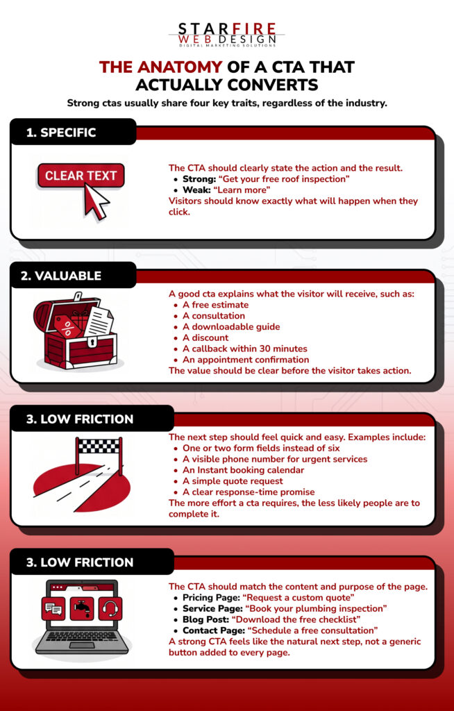
Strong CTAs usually share four key traits, regardless of the industry.
1. Specific
The CTA should clearly state the action and the result.
- Strong: “Get Your Free Roof Inspection”
- Weak: “Learn More”
Visitors should know exactly what will happen when they click.
2. Valuable
A good CTA explains what the visitor will receive, such as:
- A free estimate
- A consultation
- A downloadable guide
- A discount
- A callback within 30 minutes
- An appointment confirmation
The value should be clear before the visitor takes action.
3. Low Friction
The next step should feel quick and easy.
Examples include:
- One or two form fields instead of six
- A visible phone number for urgent services
- An instant booking calendar
- A simple quote request
- A clear response-time promise
The more effort a CTA requires, the less likely people are to complete it.
4. Relevant to the Page
The CTA should match the content and purpose of the page.
- Pricing page: “Request a Custom Quote”
- Service page: “Book Your Plumbing Inspection”
- Blog post: “Download the Free Checklist”
- Contact page: “Schedule a Free Consultation”
A strong CTA feels like the natural next step, not a generic button added to every page.
THE 202% RULEPersonalized CTAs convert at 202% higher rates than generic versions. Personalized does not mean the visitor’s name is on the button. It means the CTA matches the specific content of the page, the specific service being discussed, and the specific stage of the buyer’s journey that page serves. |
CTA Examples for Las Vegas Business Verticals
The best CTAs are tailored to how your specific customers make decisions. Here is what works for the industries that drive the Las Vegas local economy:
| Industry | Weak CTA | Strong CTA | Why It Works |
| Restaurant | Contact Us | Reserve Your Table Tonight | Action-specific, adds urgency with ‘tonight’ |
| Plumber | Submit | Get Your Free Plumbing Estimate | Names the service, promises speed, offers value |
| Law Firm | Learn More | Schedule Your Free Case Review | Low-friction offer, specific to legal services |
| Dentist | Get in Touch | Book Your Cleaning Appointment Online | Names the procedure, promises self-service booking |
| HVAC Contractor | Request Info | Get Your Free AC Inspection Before Summer | Seasonal urgency, specific service, free offer |
| Real Estate Agent | Contact Agent | See Available Homes in [Neighborhood] | Interest-driven, location-specific, no commitment |
| Salon / Spa | Reach Out | Book Your Appointment in 60 Seconds | Speed promise, low friction, clear outcome |
| Photographer | Inquire | Check Availability for Your Date | Specific to the booking question prospects actually have |
Notice the pattern: every strong CTA names what the visitor will get, reduces the perceived effort, and uses language that matches the visitor’s actual thought process at that moment.
Where to Place CTAs for Maximum Impact
CTA placement can influence conversions just as much as the button copy. The strongest pages place CTAs at moments when visitors are most likely to take action.
1. Above the Fold
Your primary CTA should appear before the visitor needs to scroll.
This is especially important on mobile, where the CTA should be visible within the first screen.
Above-the-fold CTAs work well for visitors who:
- Already know what they need
- Are ready to contact a business
- Need urgent assistance
- Want to book quickly
For local service businesses, effective options include:
- A tap-to-call phone number
- A “Get a Free Quote” button
- A one-click booking option
- A “Call for Same-Day Service” button
2. After a Key Benefit
Place a CTA immediately after explaining an important benefit or solving a customer pain point.
This is often the moment when the visitor clearly understands the value of your service.
For example:
- Explain how your service solves the problem
- Show the customer benefit
- Support it with proof or a result
- Present the CTA as the next step
Do not make visitors scroll through several more sections after convincing them to take action.
3. At the Bottom of the Page
Visitors who reach the bottom of a page are often highly engaged. They have reviewed your services, benefits, and supporting information.
Use a strong closing CTA to help them take the next step.
Instead of repeating the hero CTA word for word, use a different message:
- Hero CTA: “Get a Free Quote”
- Closing CTA: “Ready to Get Started?”
- Alternative: “Still Have Questions? Talk to Our Team”
This gives the final CTA a more natural and conversational feel.
Keep One CTA Visually Dominant
Each page should have one primary action.
Supporting options can still appear, such as:
- A phone number
- A secondary text link
- A live-chat option
- A link to pricing or FAQs
However, these options should not compete visually with the main CTA.
Too many equally prominent choices can create hesitation. Make the primary next step obvious, easy, and consistent throughout the page.
Mobile CTA Strategy for Las Vegas Businesses
Most local customers browse and search from their phones. Mobile users behave differently from desktop users. They are more likely to tap a phone number than complete a long form, and they can easily miss a small button while scrolling.
Use Tap-to-Call Buttons
For local service businesses, calling is often the fastest path to conversion.
Make sure your phone number is:
- Clickable on mobile devices
- Styled as a clear button
- Visible in the website header
- Included throughout important service pages
Use direct wording such as:
- “Call Now”
- “Speak With Our Team”
- “Request Emergency Service”
- “Call for Same-Day Availability”
Add a Sticky Mobile CTA
A sticky CTA stays visible at the bottom of the screen while the visitor scrolls.
A simple mobile bar can include:
- A clickable phone number
- A “Call Now” button
- A “Get a Quote” button
- A booking link
This keeps the next step visible without forcing users to scroll back to the top of the page.
Keep Forms Short
Long forms can feel difficult on a small screen. Ask only for the information needed to start the conversation.
A simple mobile form may include:
- Name
- Phone number or email
- Brief message
You can collect additional details after the customer submits the initial request.
Make Buttons Easy to Tap
Mobile buttons should be large enough to tap comfortably without hitting another link by mistake.
Follow these basic guidelines:
- Use buttons at least 48 pixels tall
- Leave clear space around each button
- Use short, readable button text
- Make the primary CTA full-width when appropriate
- Avoid placing multiple competing buttons together
The goal is simple: make it easy for mobile visitors to call, book, or request information without unnecessary steps.
How to Test and Improve Your CTAs Over Time
CTA optimization is not a one-time project. It is an ongoing process of testing, measuring, and refining based on what your specific audience responds to. Here is a practical framework:
| Test Variable | What to Compare | How to Measure |
| CTA copy | “Get a Free Quote” vs. “See Pricing” vs. “Book a Call” | Click-through rate on the button |
| Button color | Your current color vs. a high-contrast alternative | Click-through rate (test one color at a time) |
| Placement | Above fold only vs. above fold + mid-page | Conversion rate per page session |
| Form length | 3 fields vs. 5 fields vs. 7 fields | Form completion rate |
| Urgency language | “Book Today” vs. “Book This Week” vs. no urgency | Conversion rate comparison |
| Offer framing | “Free Consultation” vs. “Free Audit” vs. “Free Estimate” | Lead volume per variant |
Run each test for at least two weeks or until you have at least 200 clicks per variant, whichever comes first. Testing on low-traffic pages produces unreliable results. Focus your tests on your highest-traffic pages first for meaningful data.
STARFIRE INSIGHTMost Las Vegas small business websites never test their CTAs at all. The button copy that was written during the original build stays there for years without anyone questioning whether it is the best option. Even a single test that changes ‘Contact Us’ to a service-specific CTA typically produces a measurable conversion lift. Start with your homepage and your highest-traffic service page. |
Five CTA Mistakes Costing Las Vegas Businesses Leads
Even a well-designed website can lose potential customers when its CTAs are unclear, difficult to find, or poorly matched to the page.
1. Using the Same CTA on Every Page
Different pages serve visitors with different needs.
- Homepage: Introduce the primary service or offer
- Service page: Encourage a quote, call, or booking
- Blog post: Guide readers to a related service or resource
- About page: Build trust and invite a conversation
The CTA should match the visitor’s intent and stage in the decision process.
2. Burying the CTA Below the Fold
Visitors should not have to search for a way to contact your business.
This is especially important on mobile. If users must scroll through several sections before seeing a CTA, they may leave before taking action.
Place the primary CTA:
- In the hero section
- Near the top of mobile pages
- After important benefit sections
- At the bottom of the page
3. Asking for Too Much Information
A long form creates unnecessary friction.
Avoid asking for every project detail during the first interaction. Start with only the information needed to respond, such as:
- Name
- Phone number or email
- A brief description of the request
Additional details can be collected after the customer makes contact.
4. Ending Blog Posts Without a CTA
Blog posts can bring valuable search traffic to your website. However, readers may leave without taking action if the article does not guide them toward a clear next step.
End each post with a relevant CTA, such as:
- “Request a Free Estimate”
- “Schedule a Consultation”
- “Explore Our Related Service”
- “Download the Checklist”
- “Call Our Las Vegas Team”
The CTA should connect naturally to the topic of the article.
5. Using Too Many Competing CTAs
Too many choices can make the next step unclear.
A page that promotes all of the following equally may overwhelm visitors:
- Get a Free Quote
- Book a Consultation
- Call Now
- Download a Guide
- Follow Us on Instagram
Choose one primary CTA and make it visually dominant. Secondary actions can still appear, but they should support rather than compete with the main goal.
Is Your Website Turning Visitors Into Customers?Starfire Web Design builds Las Vegas business websites with conversion strategy built into every page. From CTA placement to form optimization to mobile-first design, we engineer sites that turn traffic into revenue. Request a free conversion audit and find out exactly where your website is losing leads. |
Frequently Asked Questions
Q: What is a call to action in digital marketing?
A call to action (CTA) is a prompt on your website, email, or ad that tells the visitor what to do next. It can be a button, a link, a phone number, or a form. The CTA bridges the gap between someone reading your content and someone taking a business action like calling, booking, buying, or requesting a quote.
Q: How many CTAs should I have on a page?
One primary CTA per page. You can include supporting CTAs (like a phone number in the header or a secondary link), but only one action should be visually dominant. Research shows that reducing to a single CTA per page can increase conversions by up to 266%.
Q: What makes a good CTA for a local business?
A good local business CTA is specific (names the service), valuable (offers something free or helpful), low-friction (requires minimal effort), and contextually relevant (matches the page content). “Get Your Free AC Repair Estimate” outperforms “Contact Us” because it checks all four boxes.
Q: Where should I place my CTA on a page?
The three highest-converting positions are above the fold (visible without scrolling), immediately after a key benefit statement, and at the bottom of the page for visitors who read the full content. On mobile, a sticky CTA bar that stays visible during scrolling adds another high-performing position.
Q: Should CTAs be different on mobile vs. desktop?
Yes. Mobile users interact differently: they tap instead of click, prefer calling over filling forms, and have less patience for multi-step processes. Tap-to-call buttons, sticky bars, and short forms (three fields or fewer) consistently outperform desktop-style CTAs on mobile.
Q: How do I know if my current CTAs are working?
Check your website analytics. Look at click-through rates on CTA buttons, form completion rates, phone call volume from the website, and overall conversion rate (leads divided by visitors). If your site gets traffic but generates few leads, your CTAs are likely the bottleneck.
Q: How often should I test my CTAs?
Run a new CTA test every four to six weeks on your highest-traffic pages. Test one variable at a time (copy, color, placement, or form length) so you can isolate what drives the change. Even small improvements compound over time.