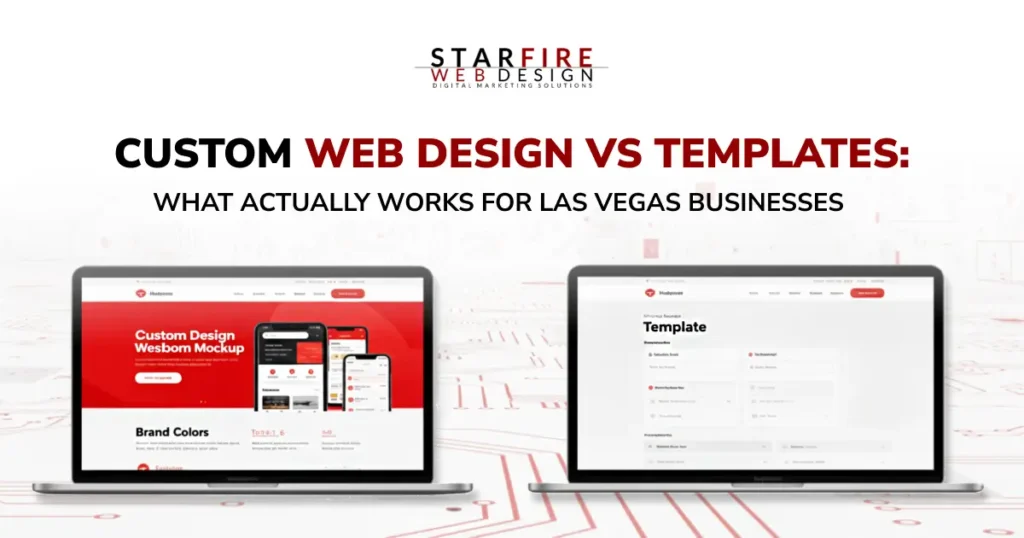
Custom Web Design vs Templates: What Actually Works for Las Vegas Businesses
Key Takeaways Let’s Get Honest About What Your Website Is Supposed to Do A website doesn’t need to be beautiful to be effective.It needs to be clear. Clear about who you are.Clear about what you offer.Clear about what someone should do next. If your site isn’t helping visitors make a decision, it’s not working for […]
2026 Web Design Trends Every Las Vegas Business Should Know

In 2026, excellent web design is equal parts craft, speed, and intelligence. For Las Vegas businesses competing online, the brands winning attention aren’t just visually impressive; they’re fast, accessible, conversion-focused, and built with scalable systems. From AI-assisted web design to modular layouts, micro-interactions, and immersive 3D experiences, modern websites are evolving into high-performance digital assets. […]
Website Redesign: Signs You Need One (And What It Costs)
Is your website outdated, hard to navigate, or losing traffic? These are clear signs it’s time for a redesign. At Starfire Web Design, our $15,000+ redesigns—priced based on your business goals, site size, and functionality—deliver more than a fresh look; they boost UX, SEO, and ROI. We protect your existing traffic with careful URL mapping and meta-data transfer while unlocking growth through modern design and mobile optimization. Wondering if it’s worth it? Discover why a strategic overhaul is a game-changer for serious businesses.
This excerpt captures the essence of the post, highlights key pain points, and teases Starfire’s value proposition while incorporating target keywords to hook readers and search engines alike. Let me know if you’d like any tweaks!
Website Maintenance: Uncovering the Hidden Costs of Neglect
Neglecting your website can lead to hidden costs that hurt your business—lost leads, damaged reputation, and wasted time. Discover the pitfalls of DIY solutions and inaction, and learn how Starfire Web Design’s maintenance plans, starting at $180/month with premium hosting, deliver long-term value for growing businesses.
Starfire Web Design Helped Me Discover Web Design
A student’s internship shows how Starfire Web Design offers expertise to turn websites into business success.
Planning a Successful Website: Your Roadmap to Digital Impact
Learn how planning a successful website with Starfire Web Design drives ROI for your business with these expert tips.
FontAwesome Introduces Duo Icons & Teases Duotone Colors
FontAwesome, a leading icon library used by millions of websites, is gearing up for exciting updates. In their recent 5.9 release, they introduced 421 new icons, including ‘duo icons’—clever pairings like laptop & phone or silo & barn. They’ve also teased the upcoming addition of duotone icons, promising customizable two-tone colors via CSS pseudoclasses like ::before and ::after. While still in beta, these features hint at a vibrant future for web design. At Starfire Web Design, we’re eager to explore these enhancements in our projects, confident that FontAwesome’s benefits far outweigh any minor impact on page load times.
Basic WordPress Training
New to WordPress and unsure where to start? Starfire Web Design’s ‘WordPress Training for Clients’ guide simplifies the essentials for managing your site. Covering the basics—like logging in, navigating the WordPress Dashboard, editing content, and handling media—this tutorial empowers beginners to take control of their website. From creating pages and posts to managing users and menus, we break down the intuitive features that make WordPress the world’s top content management system. Whether you’re a client or a novice, this resource ensures you’re equipped to maintain your online presence with confidence.
Customizing Your WordPress Site: A Strategic Guide to Themes
Master customizing your WordPress site with Starfire Web Design’s guide to themes and optimization for growth.
How to Use White Space in Web Design
White space—aka negative space—isn’t just empty; it’s a web design superpower. Far from wasted, this blank canvas (any color, not just white) cuts through digital overload, making your site feel luxe, calm, and inviting. Think Google or Apple: uncluttered pages keep users lingering, slashing bounce rates and boosting SEO. Amp up spacing between text lines or use it to spotlight calls to action and key info—white space drives attention and value without flashy gimmicks.