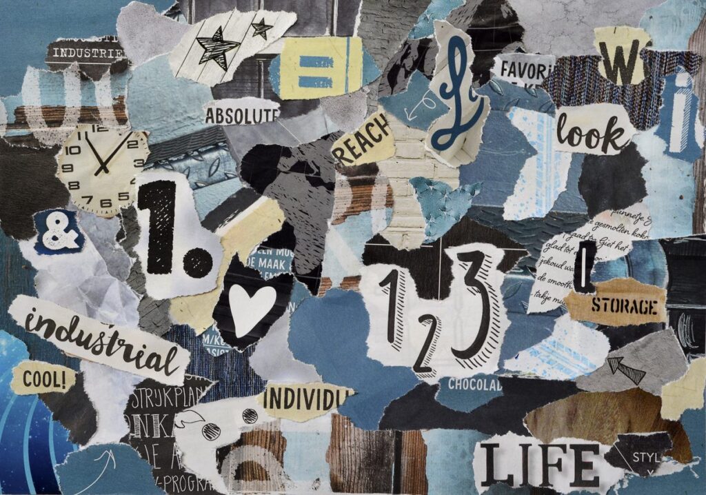
Designers of all stripes, including web designers, use quite a few tools to be creative and perfect their craft. One of them is the mood board. If this is an unfamiliar concept, yet you’re designing a website, you need to get up to speed on this invaluable device.
Back before computers were what they are today, designers literally used a board of some sort to create a collage. On it they attached items to serve as inspiration for a specific project. Today, designers can use all sorts of tools to create a virtual mood board, from a Pinterest board to Creonomy Board and more.

What goes on your mood board is completely open. Grab anything and everything that moves you when it comes to your website’s look. It can be other websites, but you might find inspiration from other sources. One source might have a font you think is perfect, while another features a color scheme that’s mind-blowing. Some inspiration might even come from nature. It really doesn’t matter, just so long as it can be used to fuel your creativity.
Too often in this digital-driven world, we only want to seek out inspiration from online sources. Sometimes the best thing to do is grab a camera and go to places that inspire you. It might be a chic shopping area, historical building or a botanical garden. Snap plenty of photos, then go through them later, adding inspirational ones to your board. It helps you be more original, because most others will be scouring the online world exclusively for their inspiration.
Make each mood board work for you. Instead of just slapping together different photos, add in some other functional elements. Make notes on the different pictures, so you remember what about each one is inspirational. Create hierarchies to keep things organized. Group pictures together by color, item, whatever.
Instead of just copying what’s on your mood board, you’ll want to use it purely for inspiration. The different items are like fuel to get your creative juices flowing, and then you make a design that’s all your own.


